
Spring 2016, visiting an old friend, I was fascinated by the stuffed animals her hunter husband had on display all over their house. I was awestruck by the beauty of a stuffed jay. Wishing of course it had been a live version i was looking at, but also realistic about never being able to see tis bird this close, was it still alive. The proximity threw me. Quite a plain colored bird. Brown, white, beige and black. And then the speckled blue at the base of its wings. The contrast of the plain colors gives this a beauty that would perhaps be unnoticed, had the whole feather clothing been equally bright all over. I keep staring at the blue pattern, not quite able to graps all the expression at once.
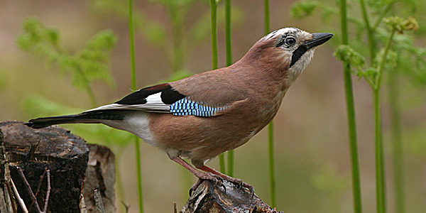
Photo by Steve Round , Wirral, Cheshire, UK, May 2004
For weeks after this experience, I play with the idea of the bright blue and black in my head. I finally sketch out an idea of using it as a pattern, covering a huge canvas that i decide to build myself form bought wood and second hand curtains! Learning the process of building my own canvas is in itself rewarding. Specially for someone who has worked mainly on a computer screen for 15 years.
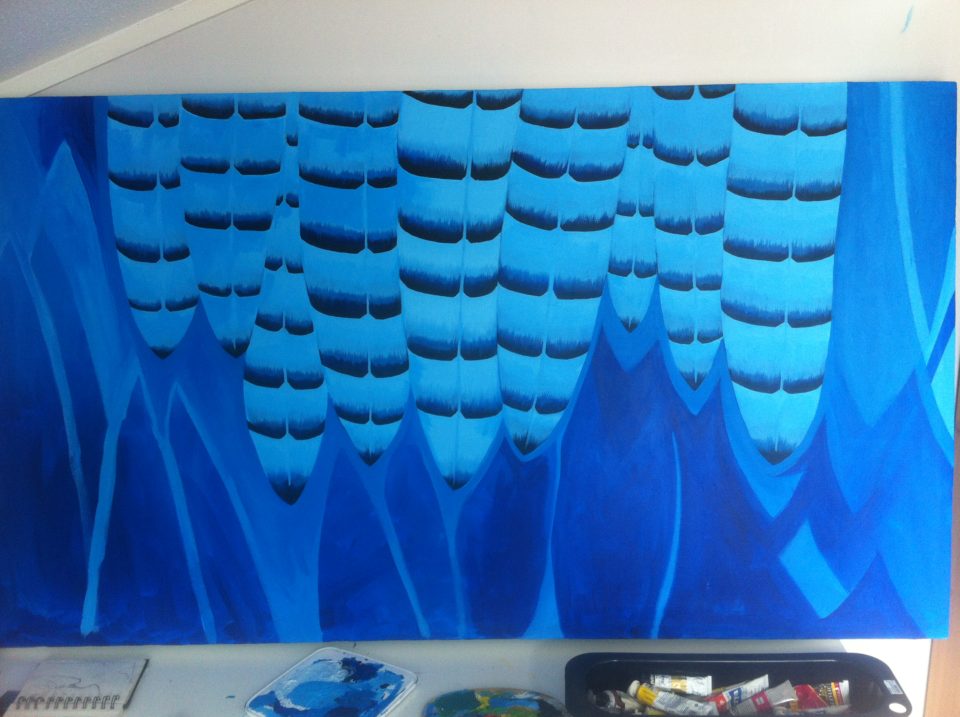
Working big is new. I am out of training, using color in this scale. I feel nervous and unsure as i move along. I can tell, on the image. It’s not flow. Its hesitant and insecure.
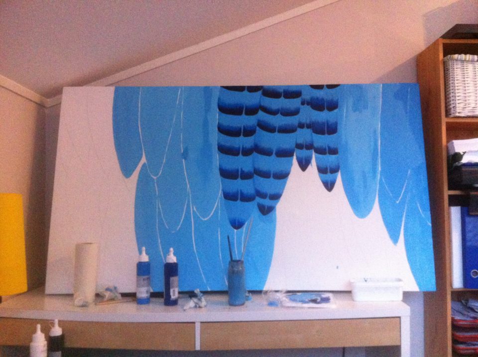
Covering the remaining white whilst hearing the sound of a rather violent “Vikings” episode in the background. Some wine might also have been involved at this stage. The combination seems to throw away some of the insecurites, and it’s fascinating to see the contrast between the different expressions. Tight and controlled, loose and dynamic.
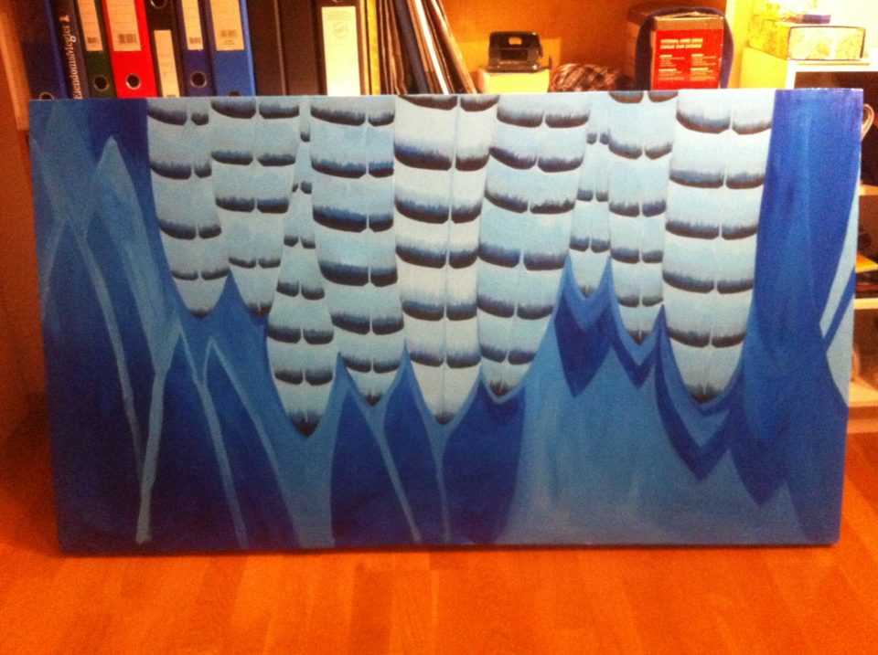
I am happy with the composition, the colors and the dynamic. I hang it up on it’s allocated place above my dining table.
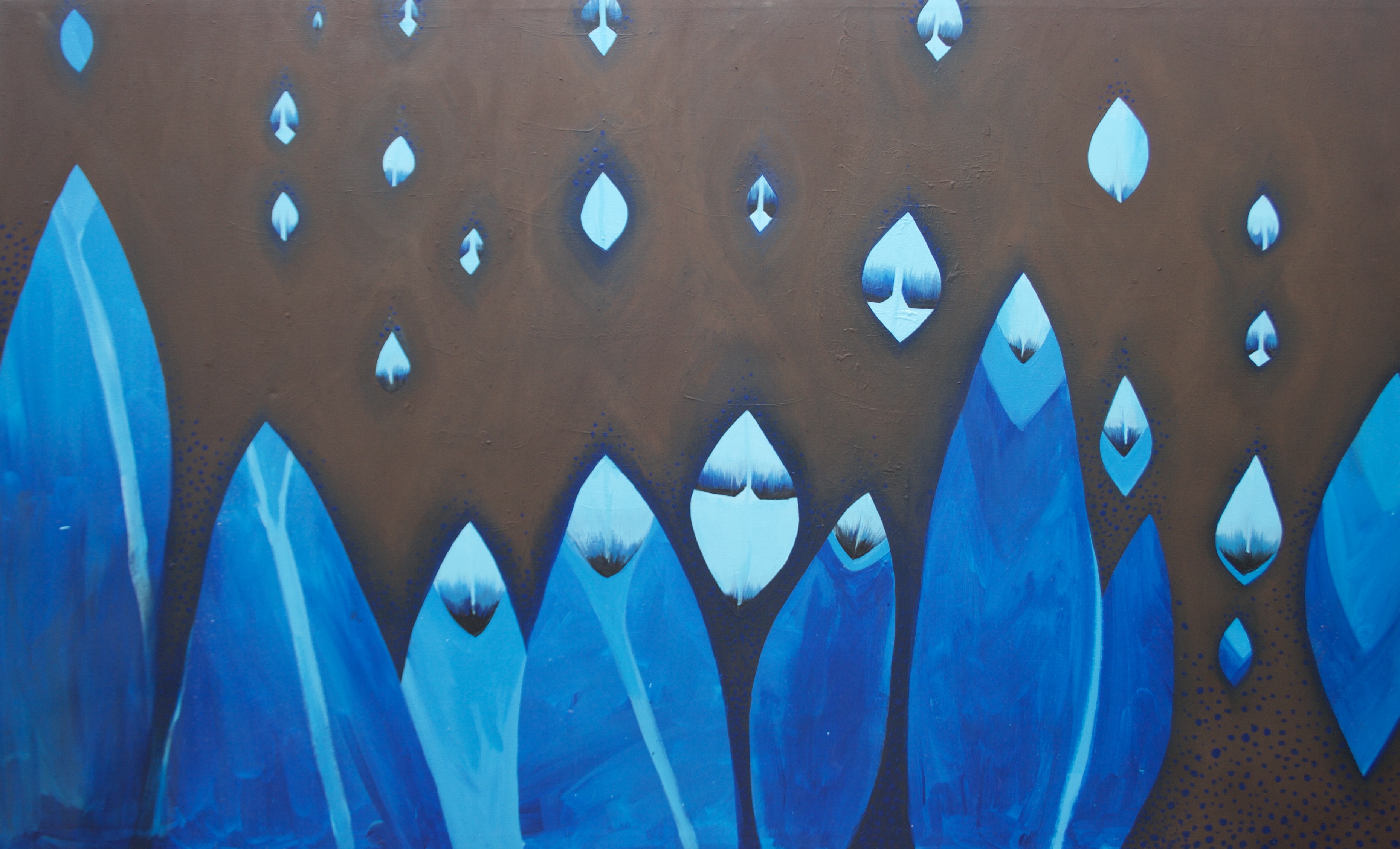
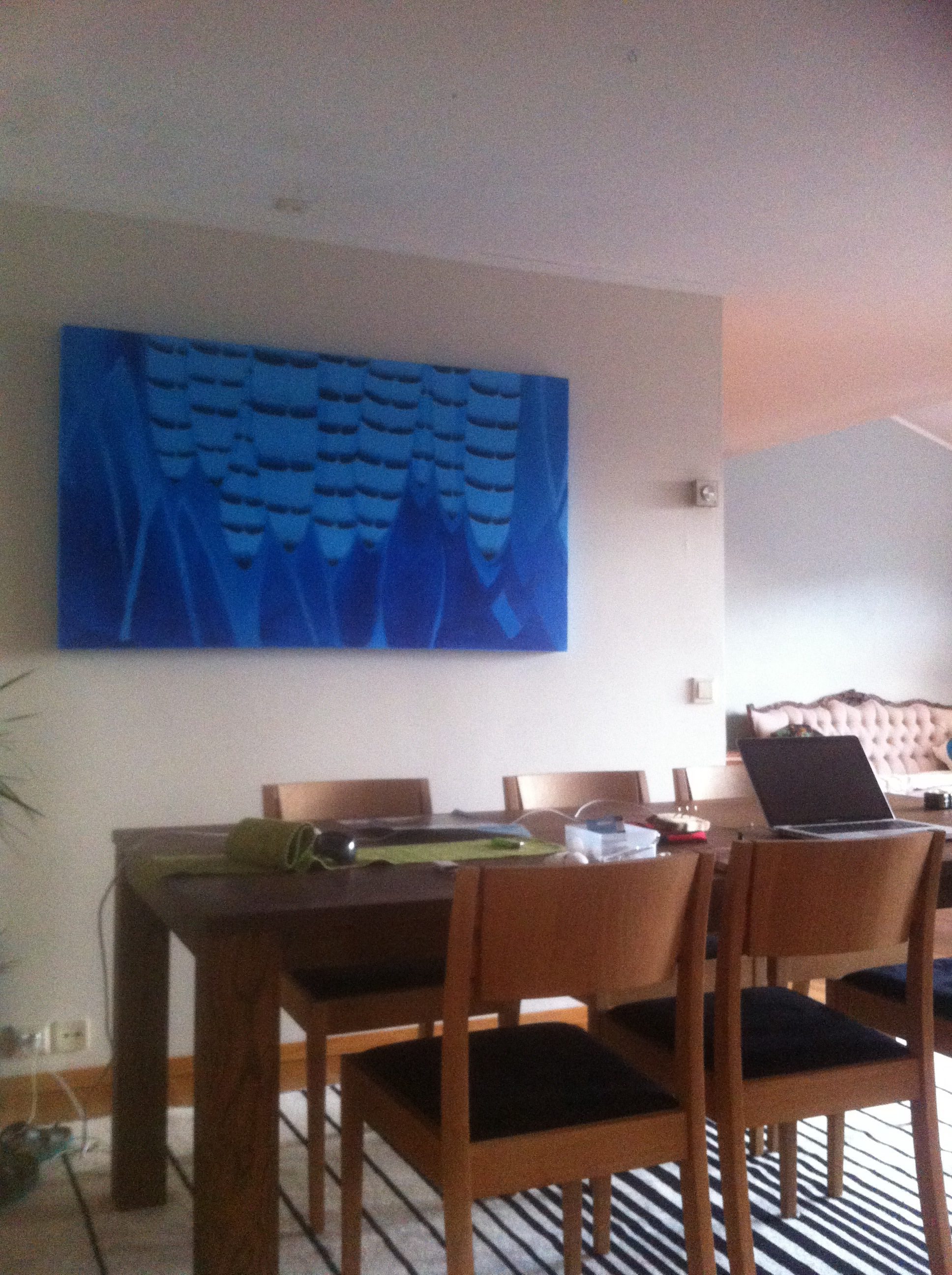 For a few weeks it’s hanging there. But it doesn’t cohere with my initial feel for the Jay. The contrast of plain and bright. Subtle and sparkly. I keep seing shapes created between the lines of the striped feathers and the darker blue, connecting the two expressions in a different way. Eventually I dive into this idea, and start painting around the lines i see in my mind.
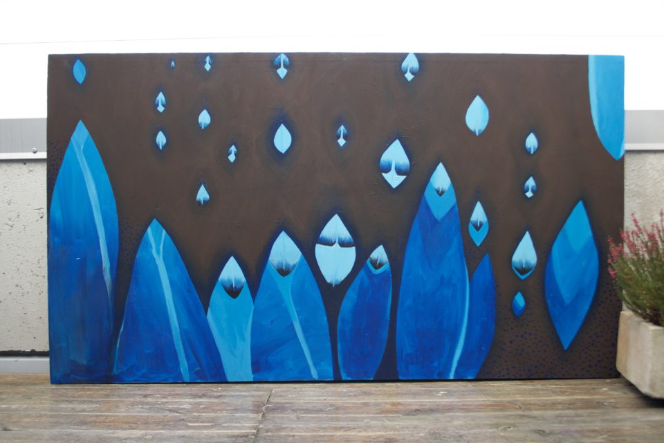
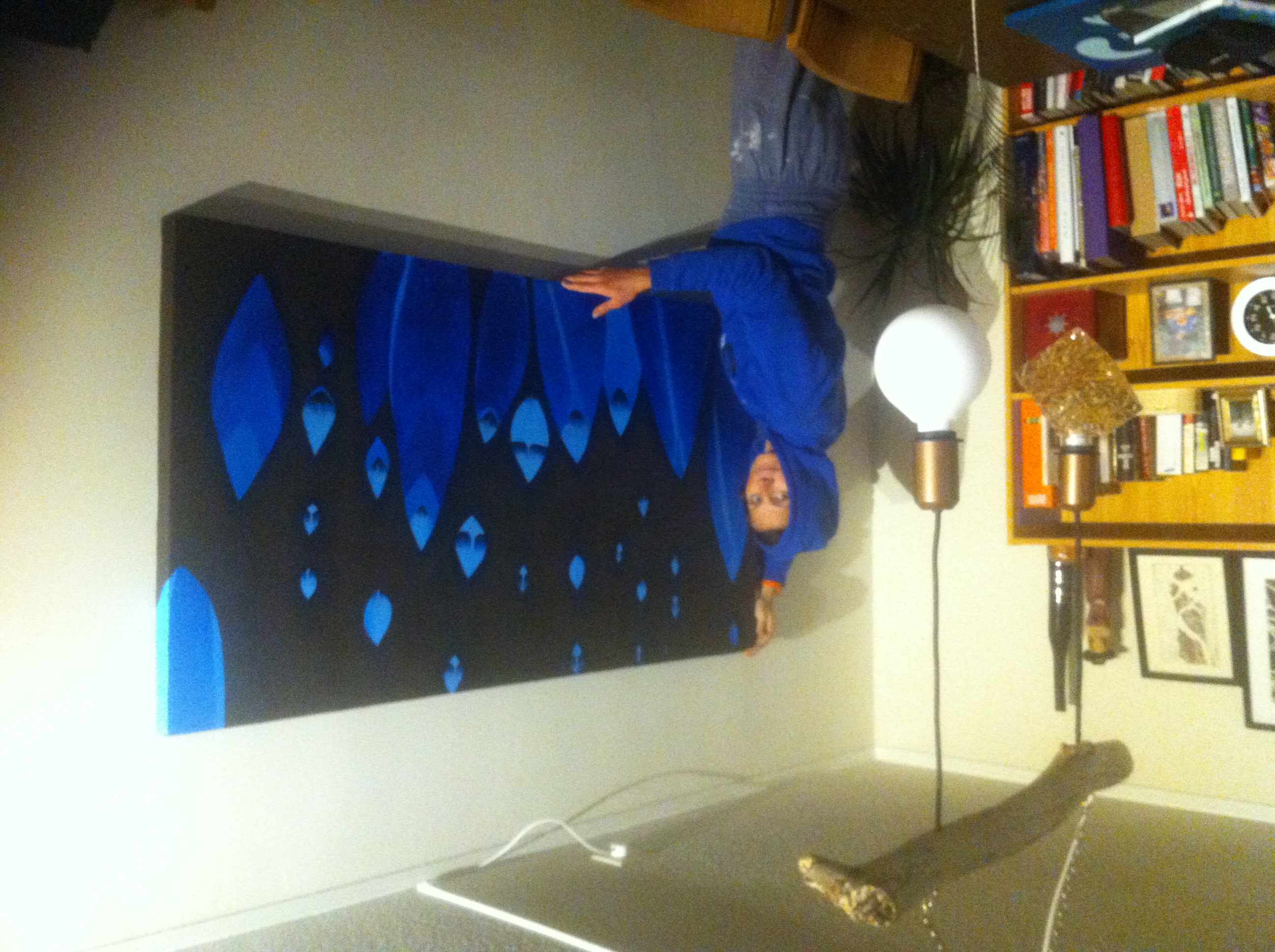
The finished result. I am not sure if it works better as an image, compared to when it was all blue. But it does work better with my initial idea.
What did i learn from this project:
- Making my own canvas is easier then i thought and fun. But also quite time consuming and not that cheap.
- Becoming aware of being tight and insecure in the painting process and what the result of this is on the canvas.
- Methods for loosening up, like music, painting fast and not caring too much about being neat and precise, and particularly wine 🙂
- How hard it is to make gradients and how much practice i need to make the gradients smooth.
- How it’s ok to leave the project for a while, and come back to it months later
- That sometimes it’s never finished. I dont know if i will change it again later
- As I work, i take quick snapshots with my iPhone. As i add photos to the blog entry, i am disappointed with the quality of the photos. I need to pay some attention to how i photograph my work.