
I was contacted by a friend of my mother a couple of months ago. She asked if i could paint a portrait of her daughter Heidi, for her 50th birthday. I agreed to do this, as i thought it would be good practice. (And since we are name sisters 😉 )
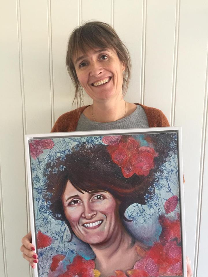
Here she is, happy 50 year old with her gift!
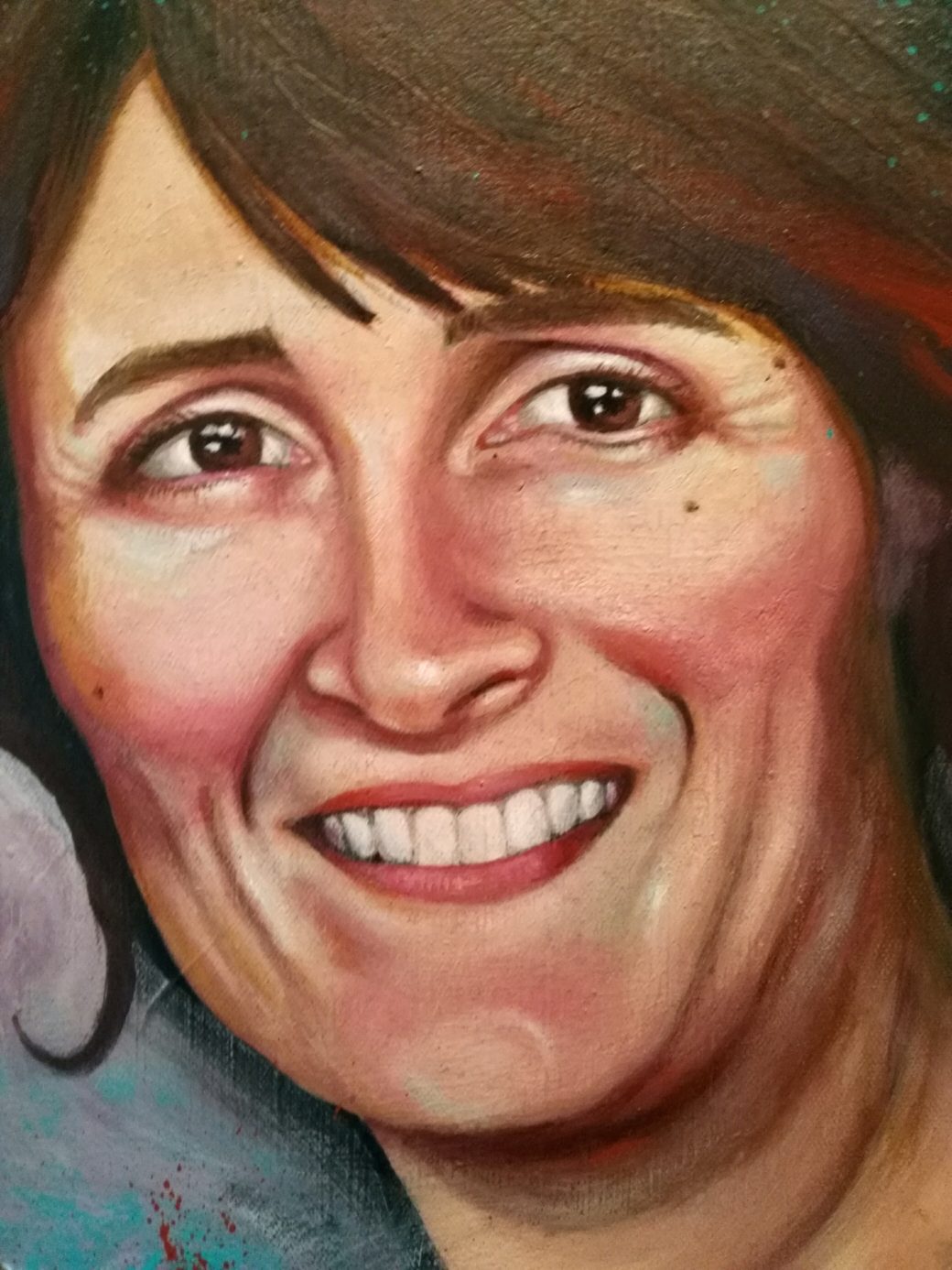
And good practice it was! The first hurdle was to find a good reference photo. When asking people to send photographs, it’s unlikely that they have high-res photos with interesting angles, expression and contrast, all in the same image. You have to start with everyday shots, most likely taken with a smartphone. One picture has a great smile, one has great contrast, one has good eyes. I picked one that i thought showed Heidi looking radiant and happy.
The light was quite flat, outdoor daylight, but by boosting the contrast and saturation, i could pick out areas of color in the face, and make them more dramatic. I used colors that was not really there, but when the light is flat, i find that using color for shading works great, and gives some dynamic and life to the face.
Progress photos
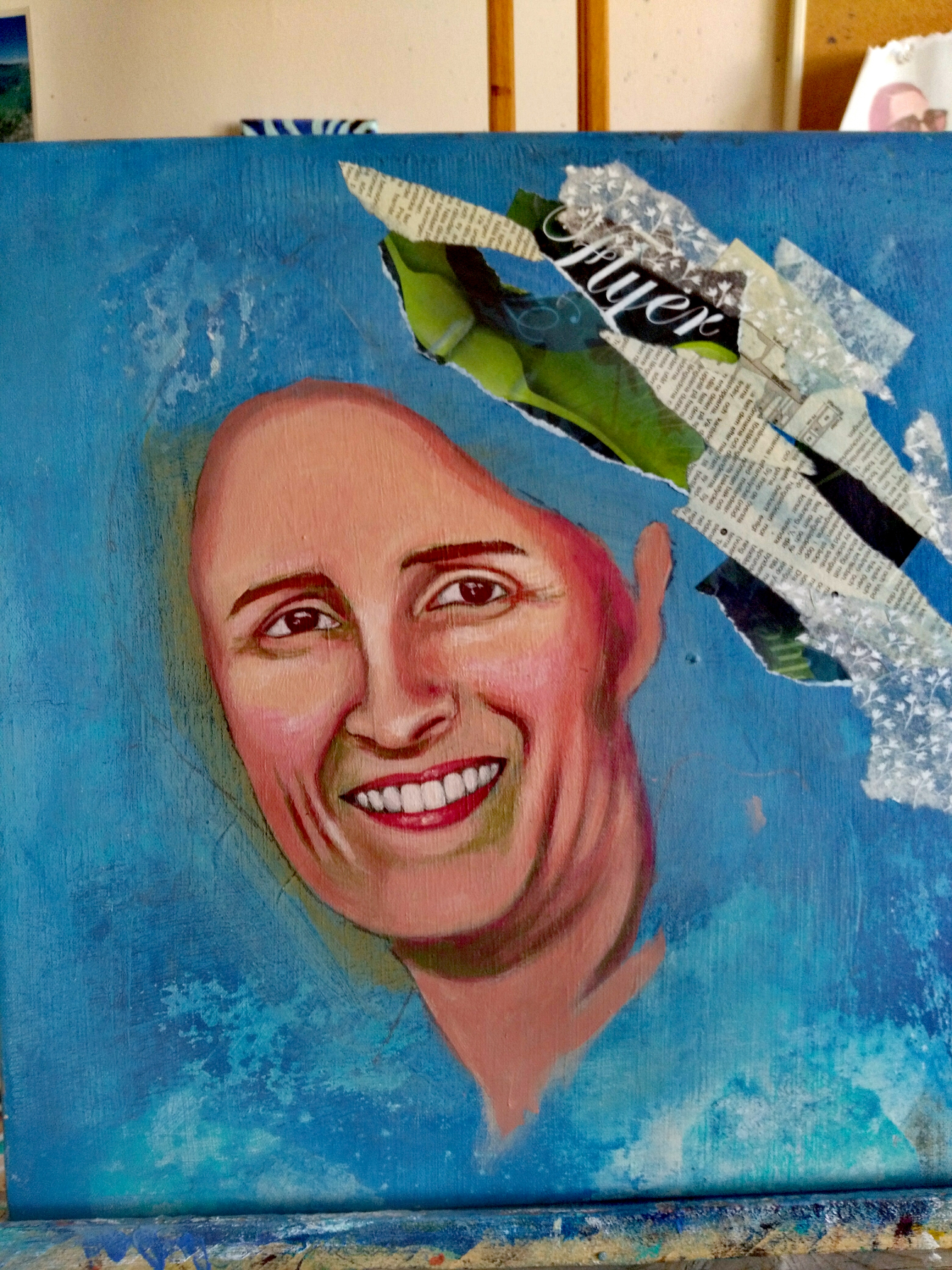
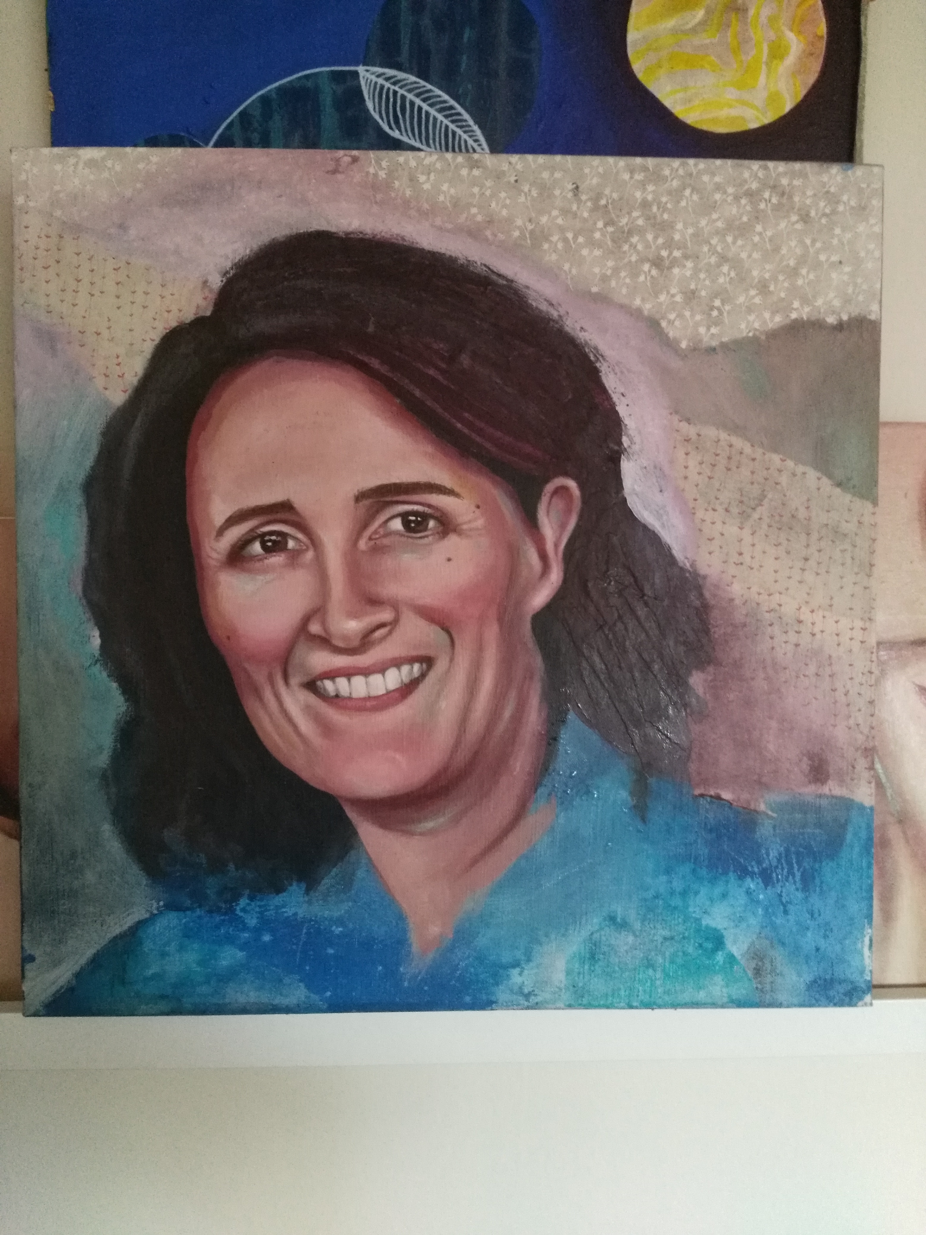
The face itself was finished in a couple of days. I was quite pleased, i though I had captured the spark in Heidis eyes, and the good smile. Then the easy part, I though. Let’s add a background. And this is how I learnt, that I should have a plan about background before i start painting. If not, I can potentially end up trying all kinds of different things, because it just doesn’t look right. I think there is 5 or so layers of collage paper in this portrait!
I used my motto, kill your babies several times, as it dawned on me, that the portrait need some dynamic, in response to the flat light. In a portrait with dramatic shading, it’s easier to have a neutral background, as the composition of light and dark and the shades in between creates enough interest.
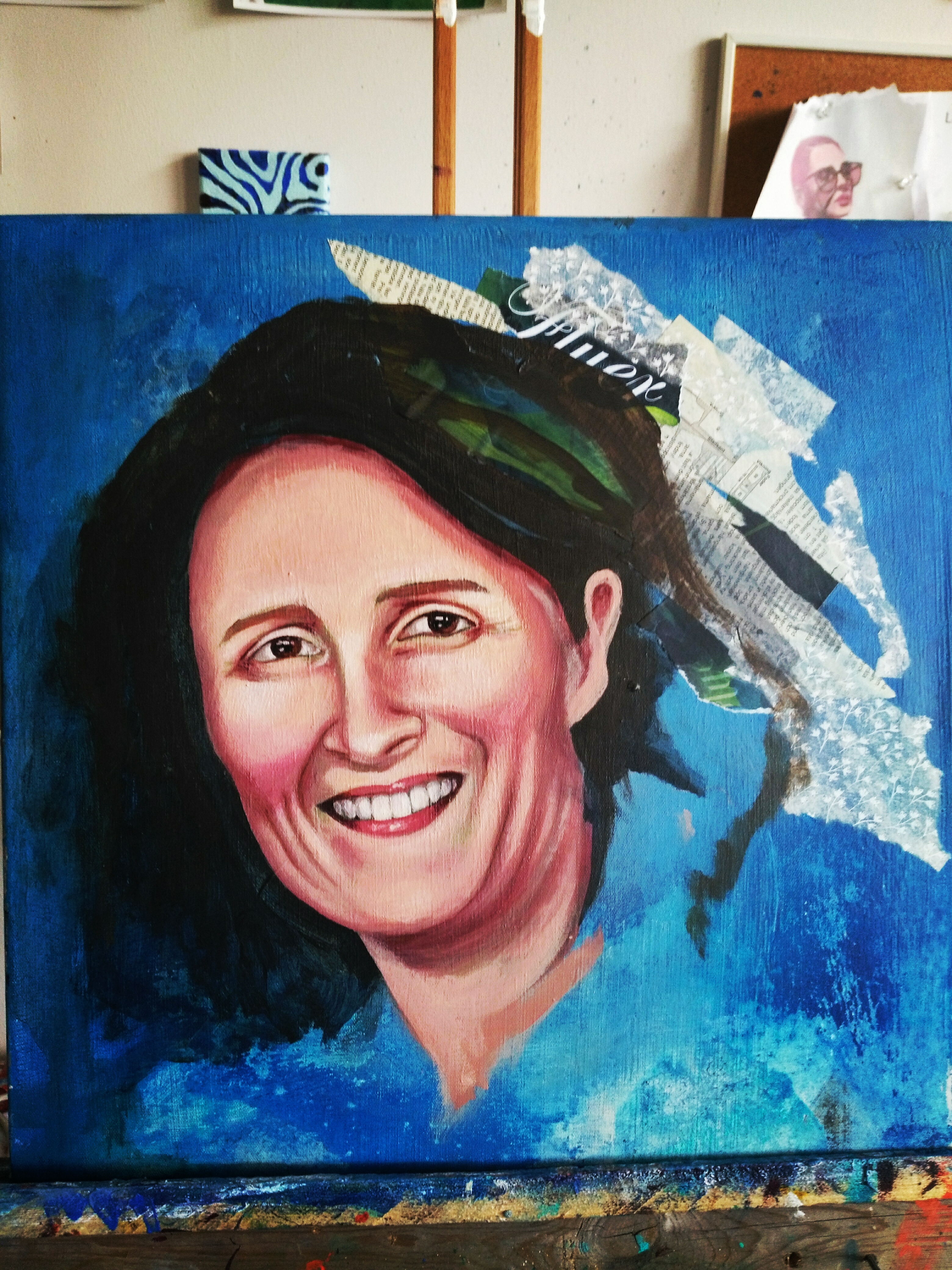
So, Heidi ended up with her hair up loosely, crowning the face. This photo is just before i added the finishing touches, which you can see in the photo of Heidi holding the painting. I thought i had taken a good photo of the final piece, but i had not!!
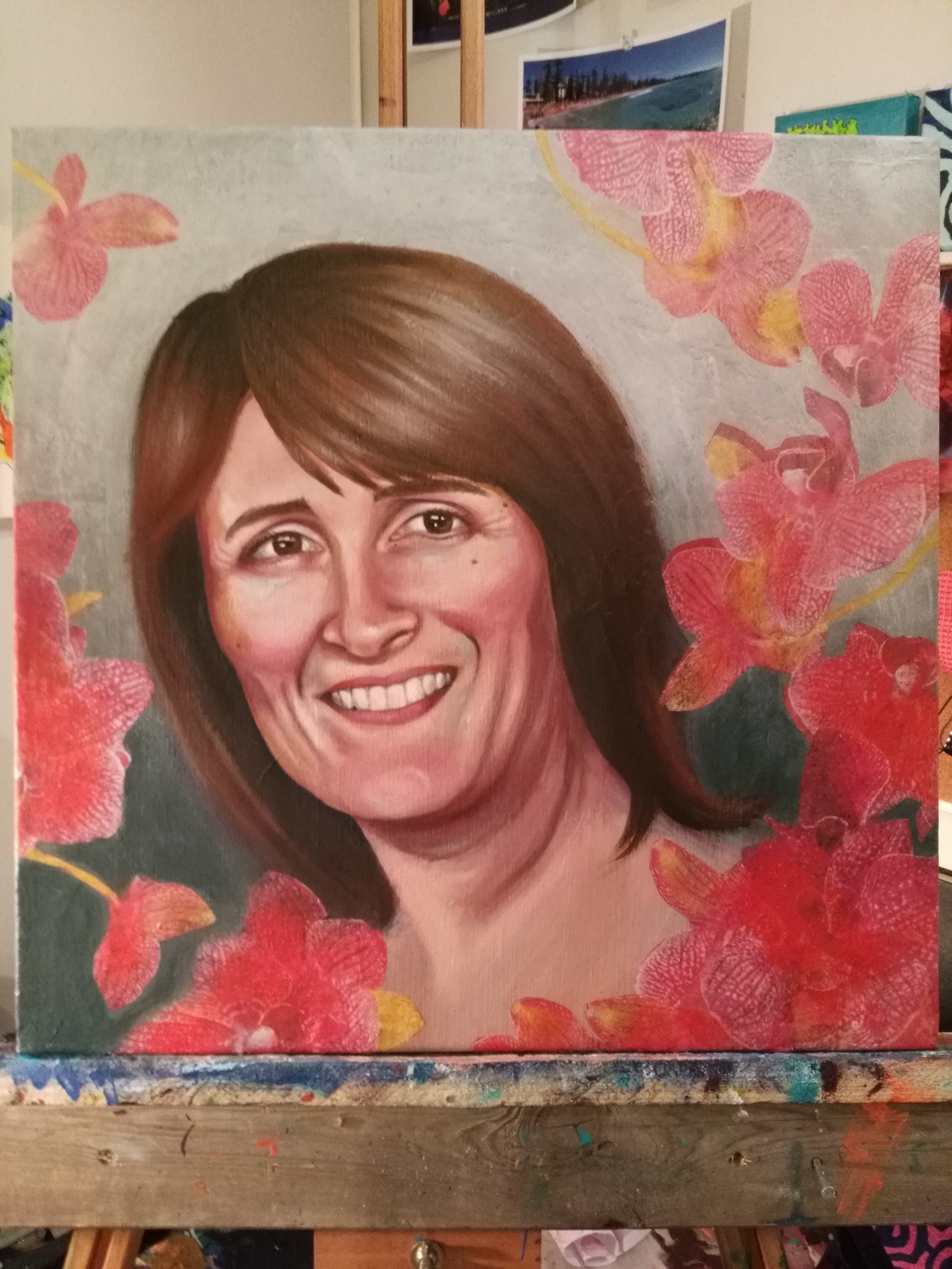
Roses and flowers surround the head, creating a more dynamic composition, with colors in the face seen again in the background elements. I think she now looks content, happy, at ease, surrounded by natures beauty. I don’t know Heidi myself, but I know her mother to be in love with plants and nature, so hopefully, it must be a fitting setting for Heidi as well.
The biggest hurdle I had, was trying to guess what color and tone Heidi would like. I don’t know her personally, and should have asked her mother for some ideas around what she likes. This would have made the decision making process easier. I have since been told that Heidi and her mum liked the portrait! And looking back, it seems to have been easy to make the decisions that i did. But it wasn’t. I learned a lot about the process of making something for someone else! It’s a lot easier when i am the only judge. F.ex., i really like polkadots. This is a pattern i use a lot. But, someone else might hate dots! In my own paintings i can really go to town with dots, and if people like it or not, I don’t care. But hear, the finished result is kind of set beforehand. This required different rules and way of thinking about it.
What did I learn
- If I don’t know the subject, ask for as many details as I can, before I start choosing color, style and background. This will help the decisions.
- Have a plan about the background first!!!
- Do some sketches of layout, how the person will fit inside the canvas to produce a more dynamic finish.
- Give myself good time, never say yes to a rushed deadline.